Client
Logitech G
Agency
Method Inc.
Team
Ana Soto
David Mayman
Ethelind Vu
Chris Macdonald
Mily McClelland
Blake Hudelson
Nic Bourquin
Expertise & Skills
Product Design
Design Research
Prototyping
User validation sessions
Duration
6 weeks
Location
San Francisco
Opportunity
Logitech offers powerful gaming accessories that allow users to optimize their gaming experience. Traditionally sold with the accessories themselves, the existing software, while powerful, was often confusing and difficult for gamers to manipulate.
Solution
We partnered with Logitech G to redesign the G Hub. We began with understanding the needs of the users - from novice to expert, developing user profiles and understanding the modifications that allow them to get the most out of their devices.
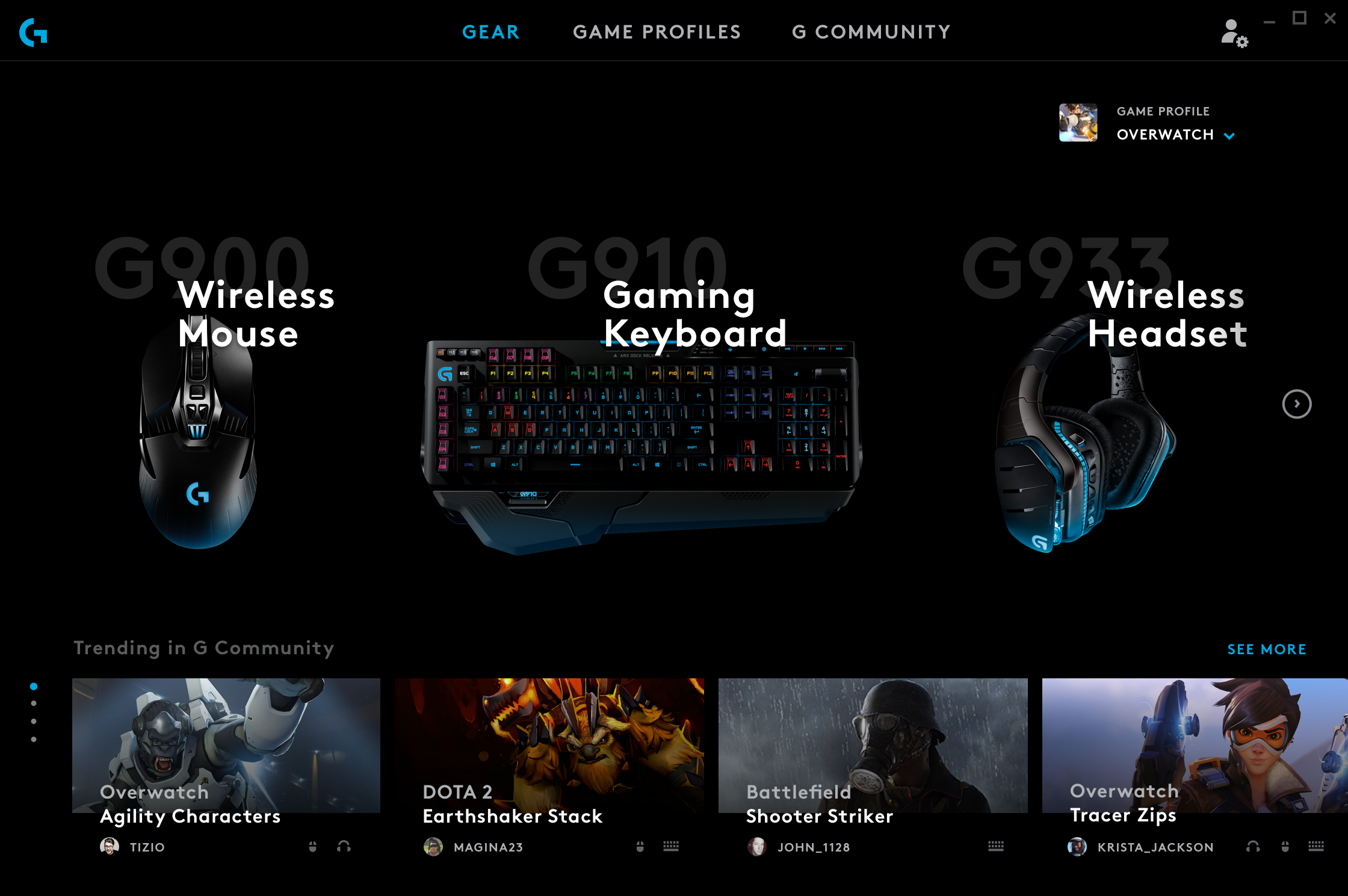
We designed the new G Hub to help gamers get the most out of their gear. With a clean and modern interface they can quickly personalize the gear per game and customize profiles; while sharing and downloading profiles from others in the community.
Understanding gamers’ needs
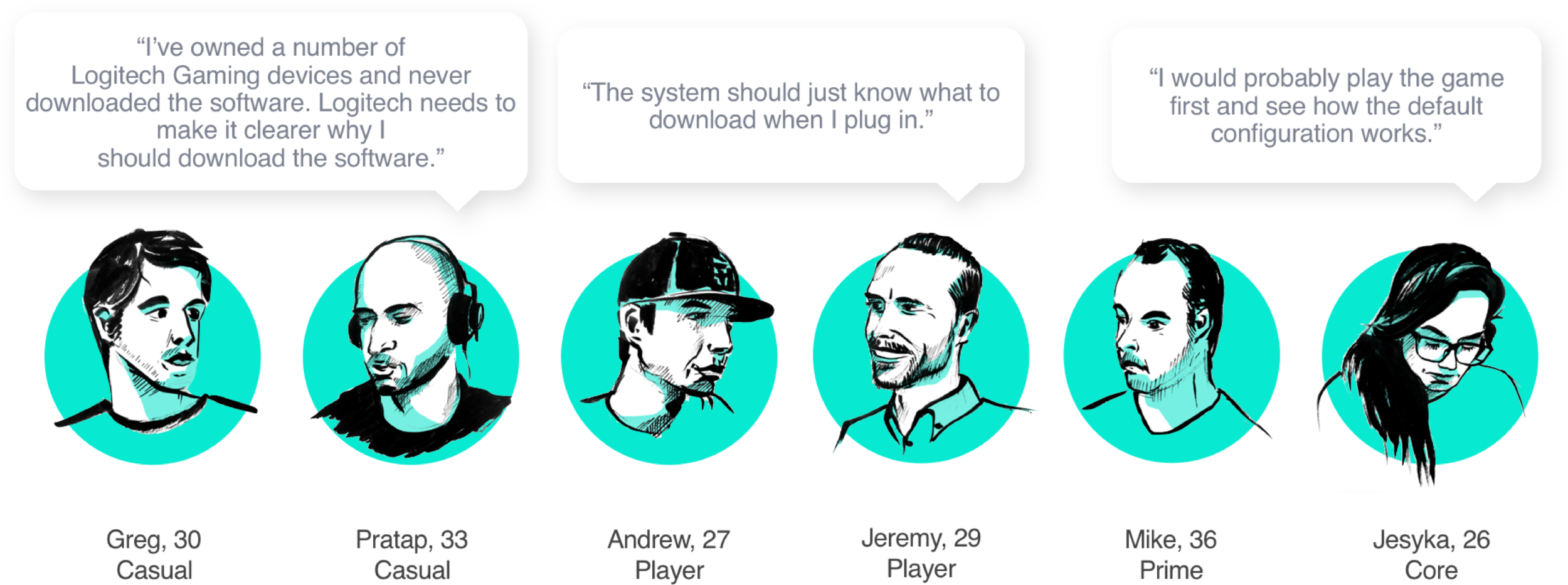
We talked to six gamers, all falling within one of Logitech’s four gamer personas, about their hardware configuration habits, and we asked them to test-drive the current LGS to gather their reactions.
We also conducted a competitive audit of Razer, Corsair and Steelseries hardware and software products to see what’s out there.
Journey mapping
From our interviews and our research, we collected actions, pain points, opportunities, business goals, and user goals, mapping them along a gamer journey.
Key research findings
Less is more, need for simplicity
Ideal setup is no setup with ability to come back later to configure advanced options
Features must be prioritized and have a sense of finality
The software would be used more if it provided value beyond just configuring hardware
Ensuring simplicity through a clear information hierarchy
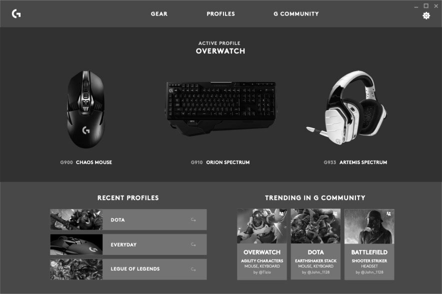
G Hub supports a wide range of devices with customizable profiles across any number of games. The level of customization can go from simple to complex very quickly. This had to be managed through an intuitive system hierarchy that was clear and simple. We designed an information architecture to solve this hierarchy and a sitemap to demonstrate how the software would express it.
Designing for the needed features across devices
Using wireframes we quickly iterated through new layouts and develop the details of the software ensuring the designs would accommodate several types of devices.
Validating with users to iterate the design
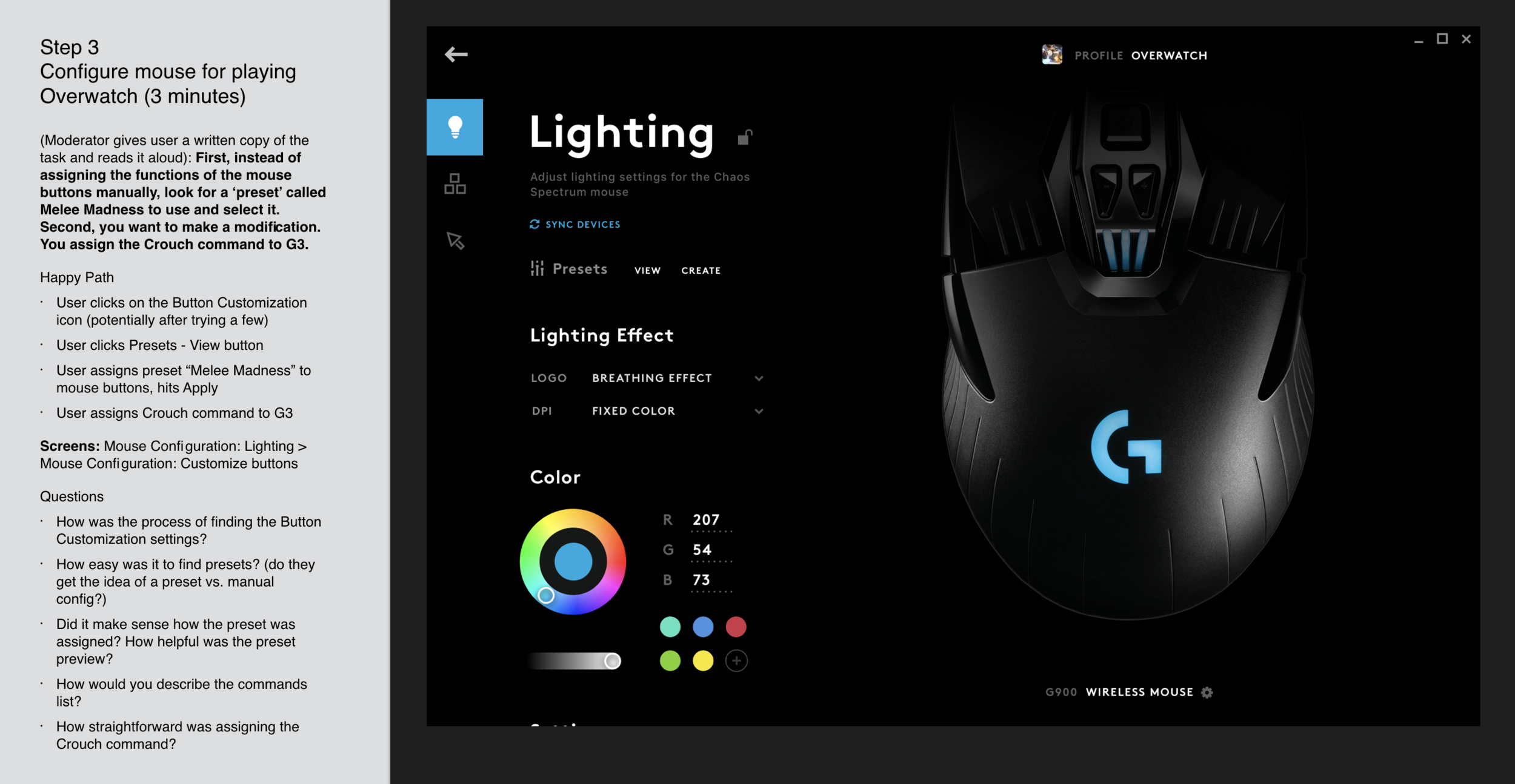
Using the prototype we tested the concepts with 12 real users from 4 market segments. The validation study was conducted over 2 weeks with daily design iterations to evolve the design. We developed a set of tests with “Missions” for users to complete and questions to ask after they tried. To convey more realism, we used a Wizard of Oz-style technique, controlling the devices participants were configuring from another room to give them the impression they were using the final software.
Mission example for user testing
Flinto Prototype
A layered interaction model
In order to convey the information hierarchy, we created a z-space dimensional interaction model where menus become more specific the further forward you go.
We developed 4 principles to guide the behaviors if the interactions.
Principle 1
Shifting Perspective
The viewable frame of the users perspective shifts in and out depending on the context of the screen, but the elements remain the same.
Principle 2
Depth Layering
Elements are placed in Z space to characterize their importance to the given scene. When the user navigates through the software, the motion should amplify this through a parallax effect.
Principle 3
Uncover & Reveal
To accent the depth of each scene, dynamic elements cast a large dark shadow on elements behind them. This is useful for transitions and state changes to add contrast. Additionally, the camera can shift slightly in Z space to indicate a new layer is now in focus.
Principle 4
Wander with Intent
Movement should feel confident, but not rushed. Hover states gesture the direction a click might head in as a preview, and transitional movement should begin quickly and end sliding carefully into place.
Project Impact
Logitech officially launched G Hub in February 2019. Gamers worldwide use it with their Logitech gaming devices.


